Reframing Women in Art Curation + Creation
Event Branding
Logo Design
Spring 2021
_Team
Riley Mehl
Ashley Tseng
Logo Design
Spring 2021
_Team
Riley Mehl
Ashley Tseng
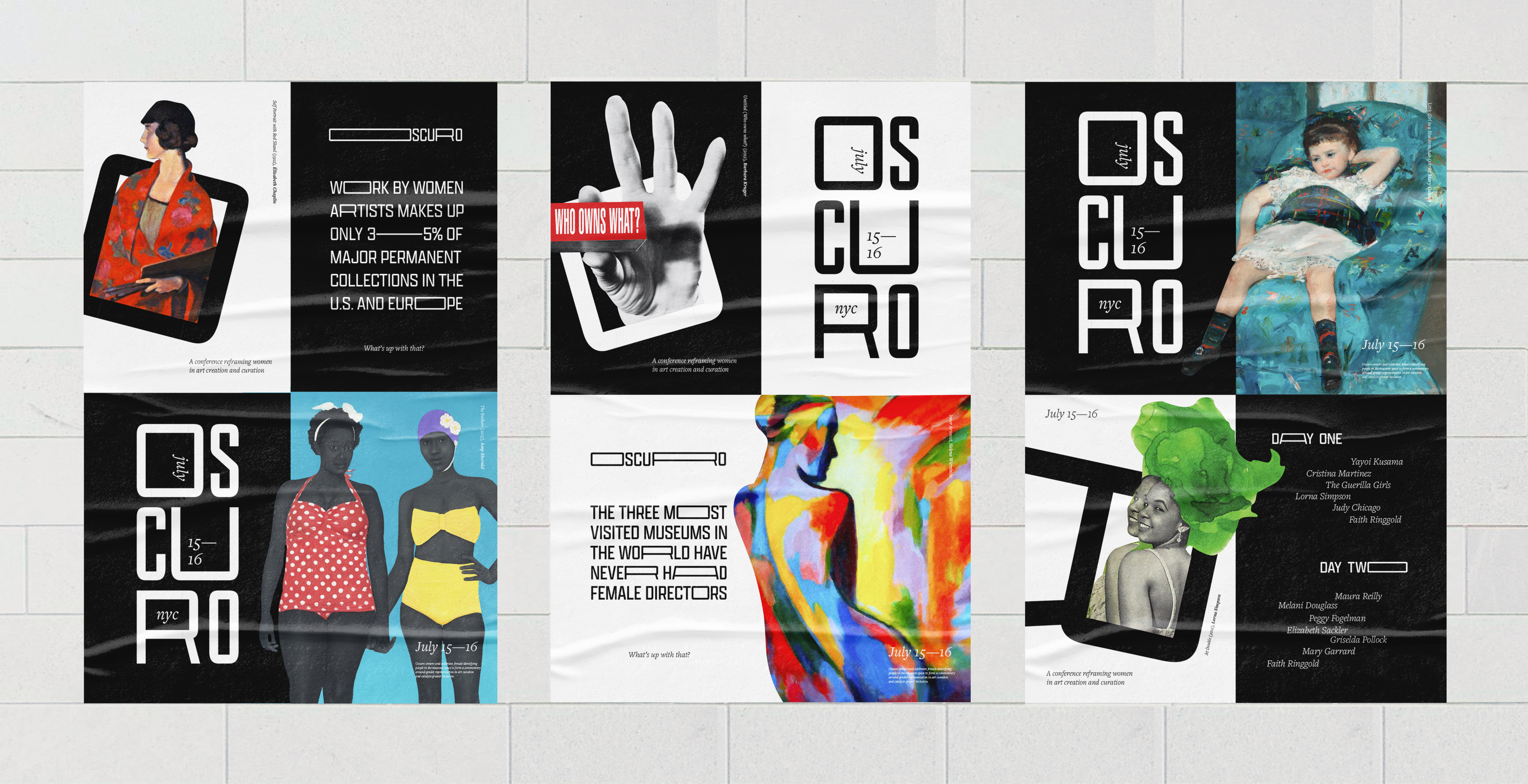
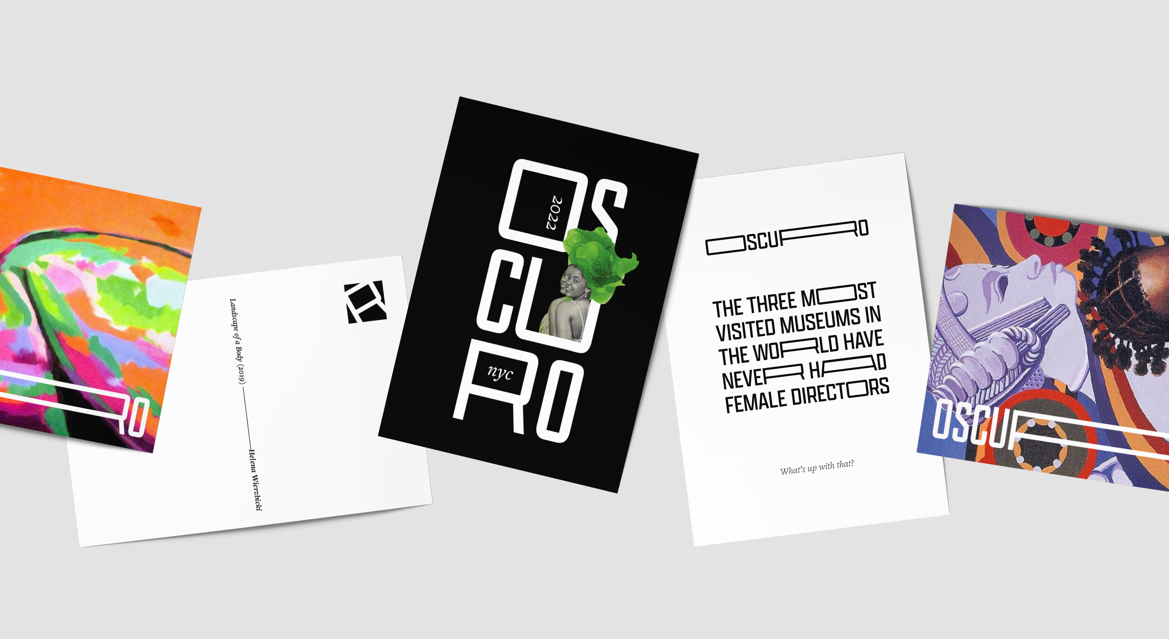
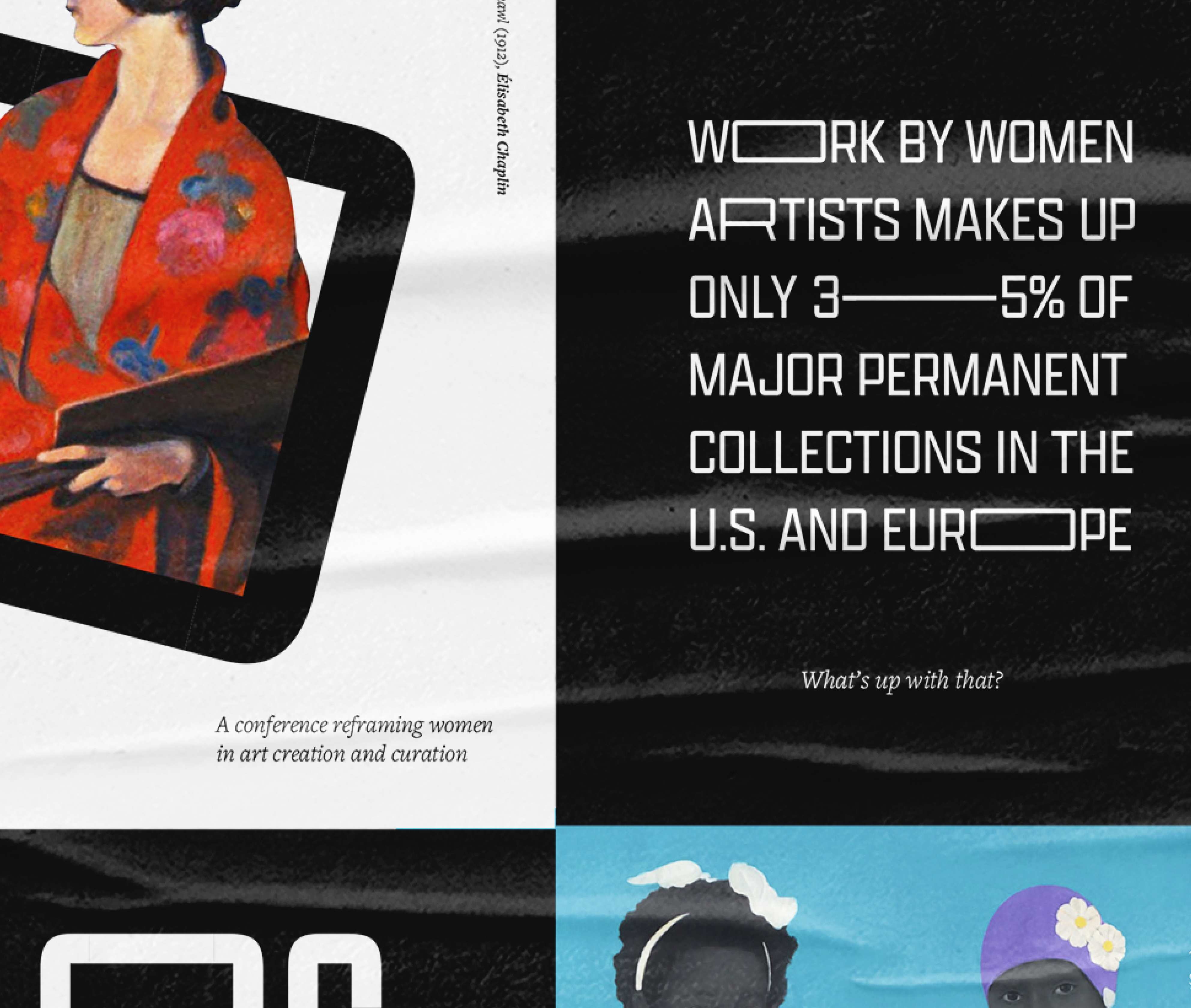
OSCURO is a conference working to reframe women in art curation + creation. The conference name, Oscuro, is derived from the Italian word chiaroscuro, an art term used to describe the use of strong contrasts between light and dark. Oscuro, meaning “dark and obscure” speaks to how the conference brings women—who have been historically marginalized in the art world—into the light.
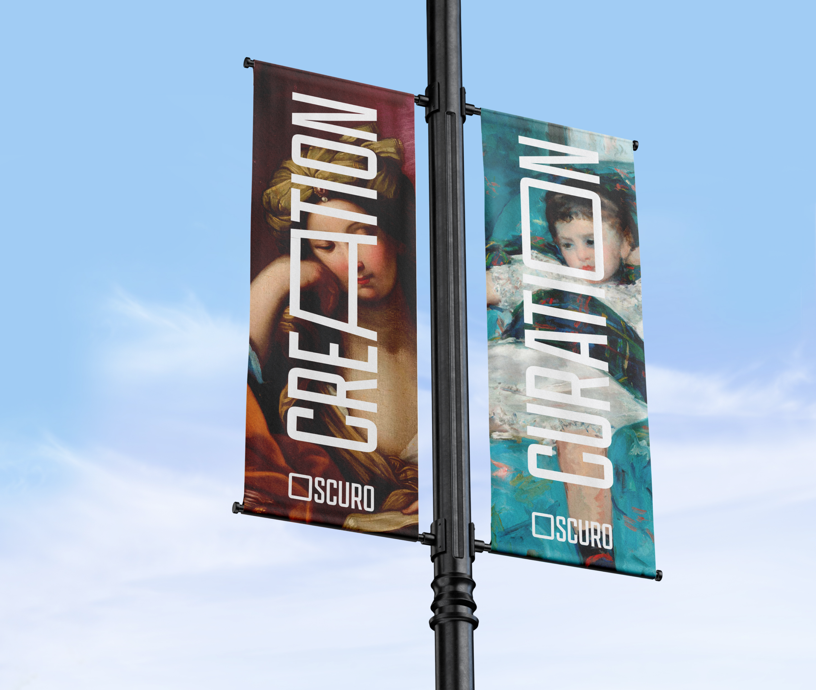
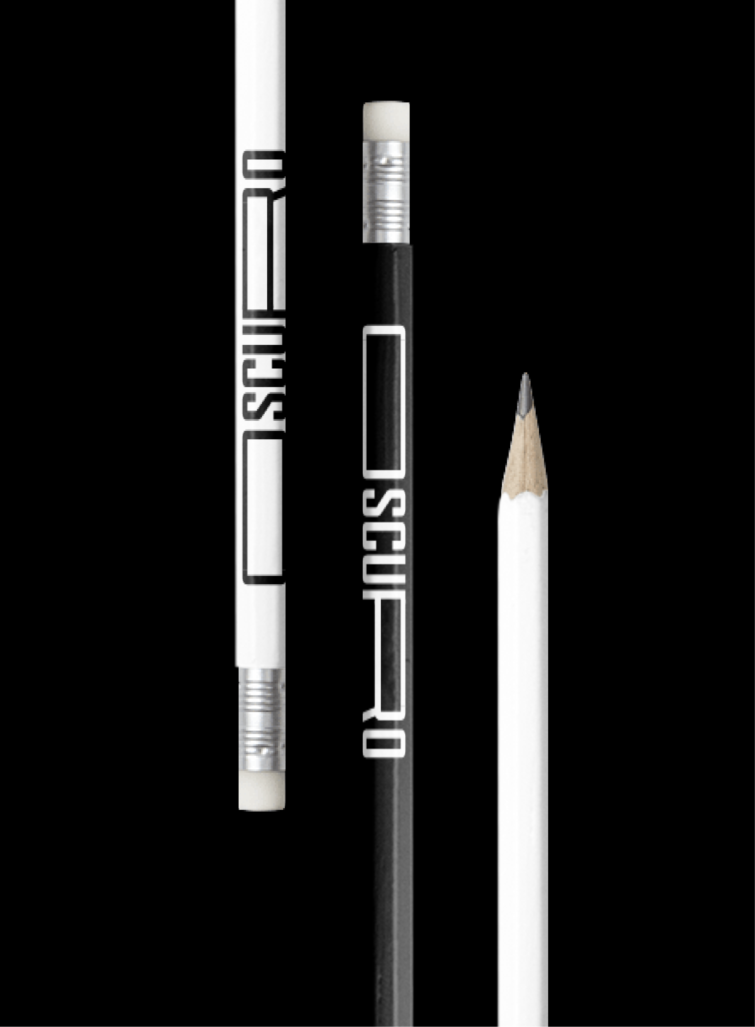
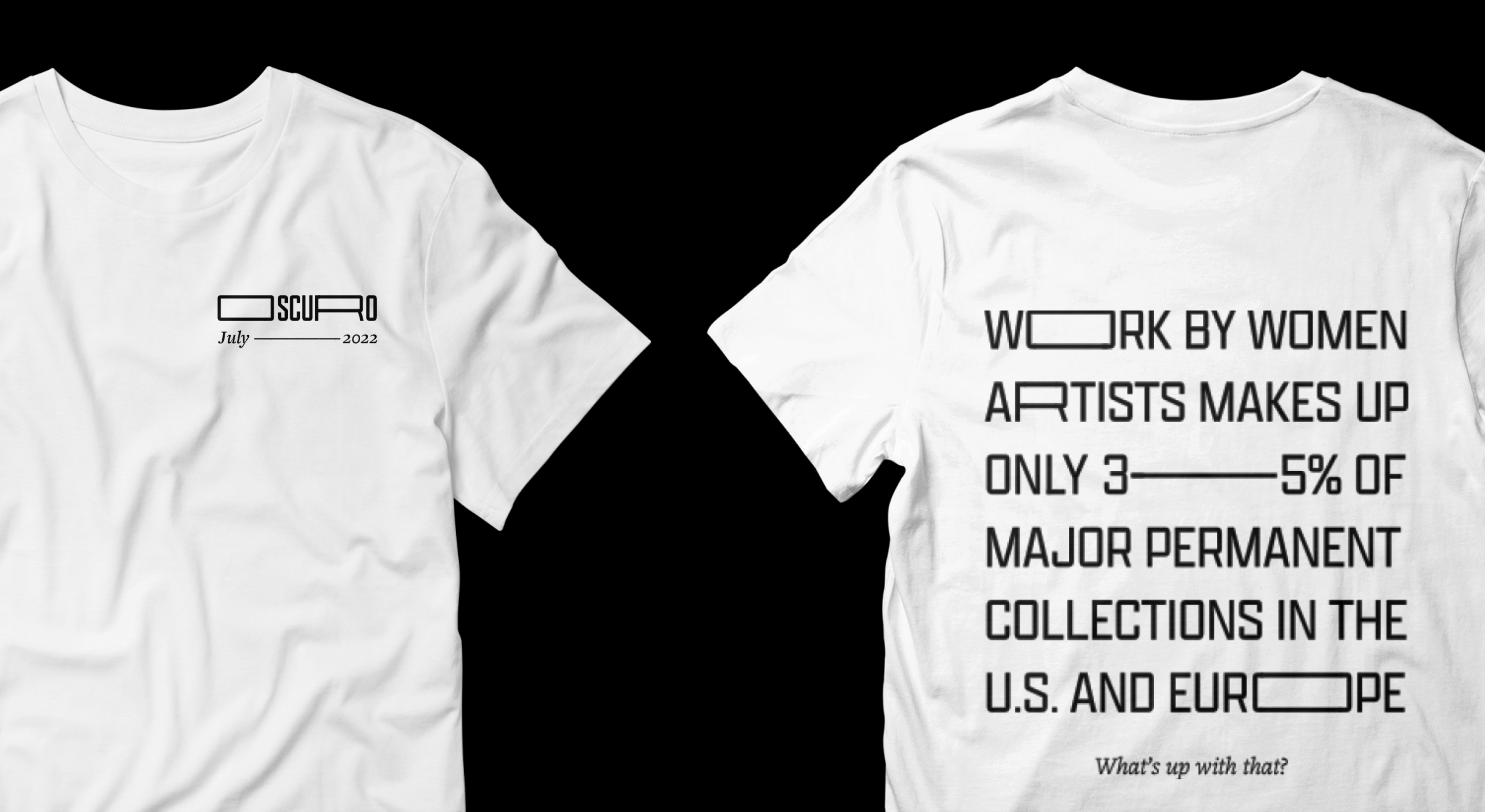
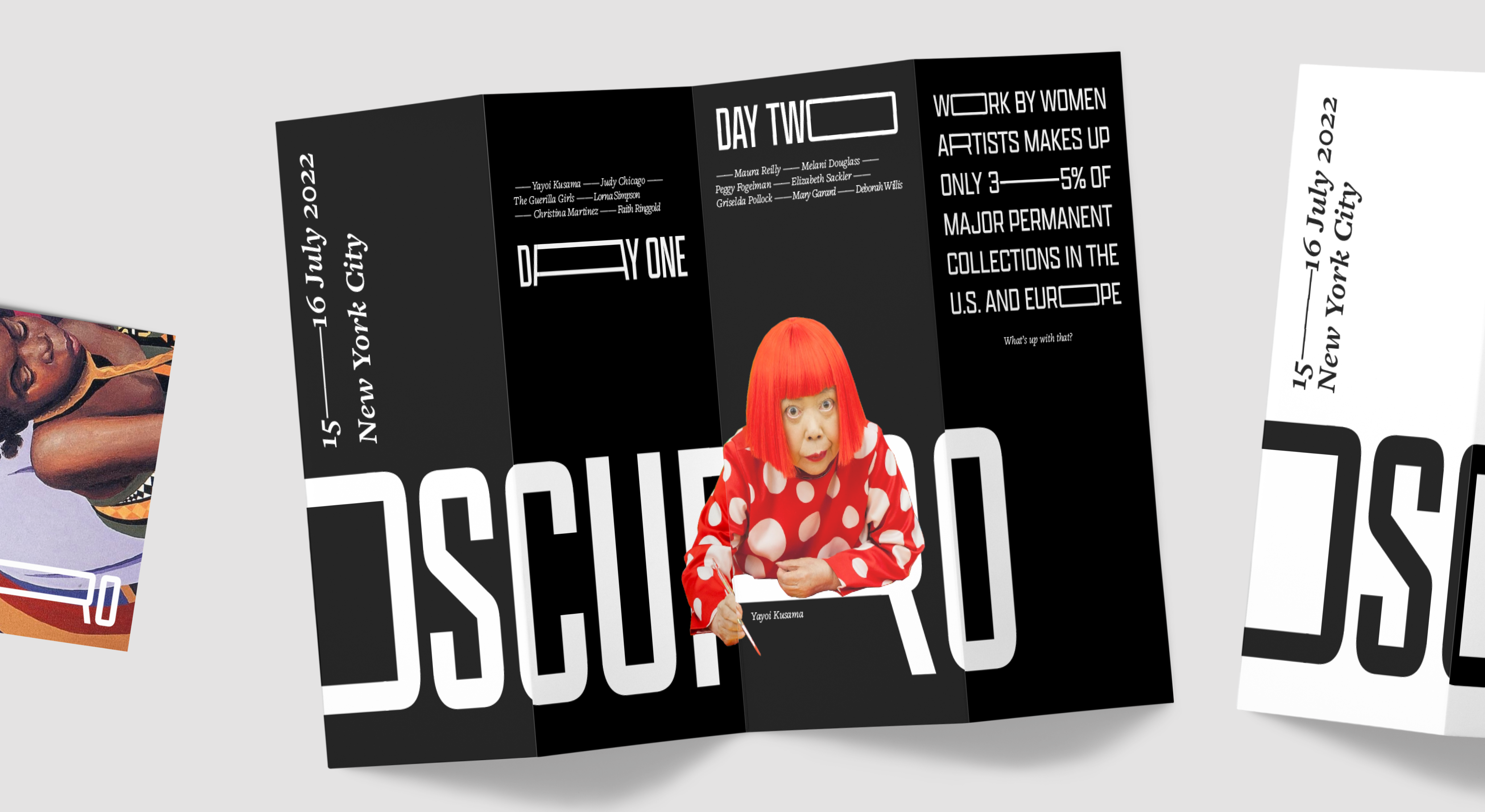
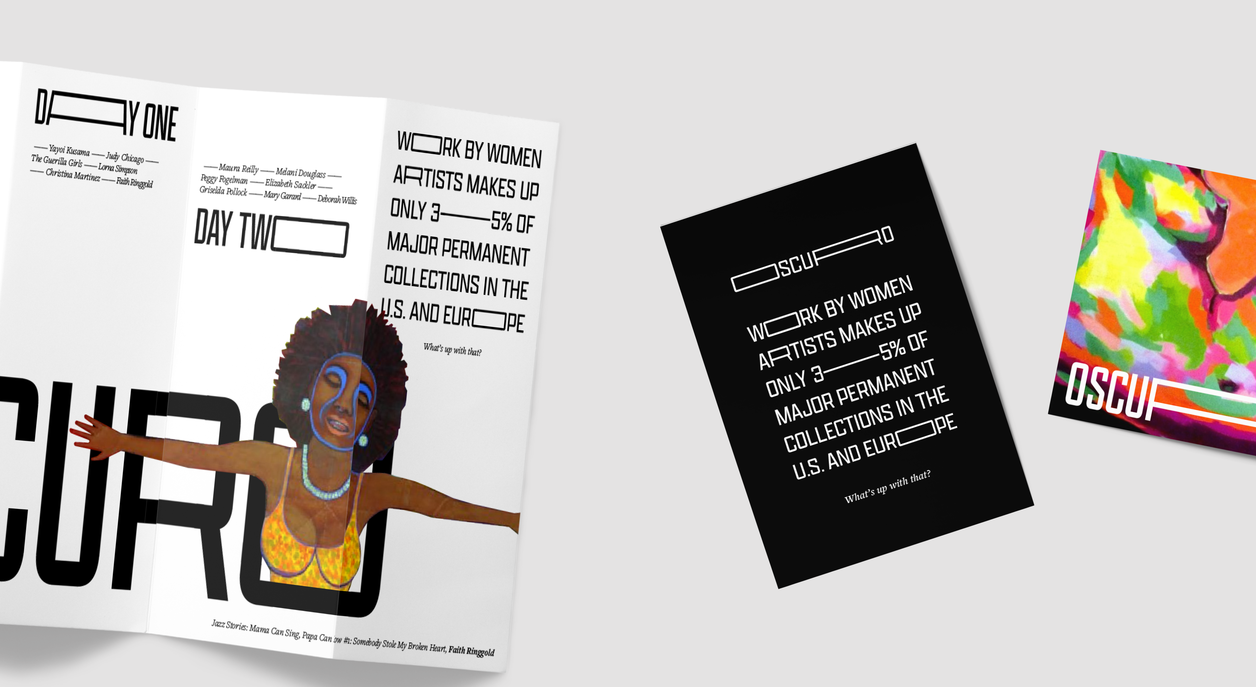
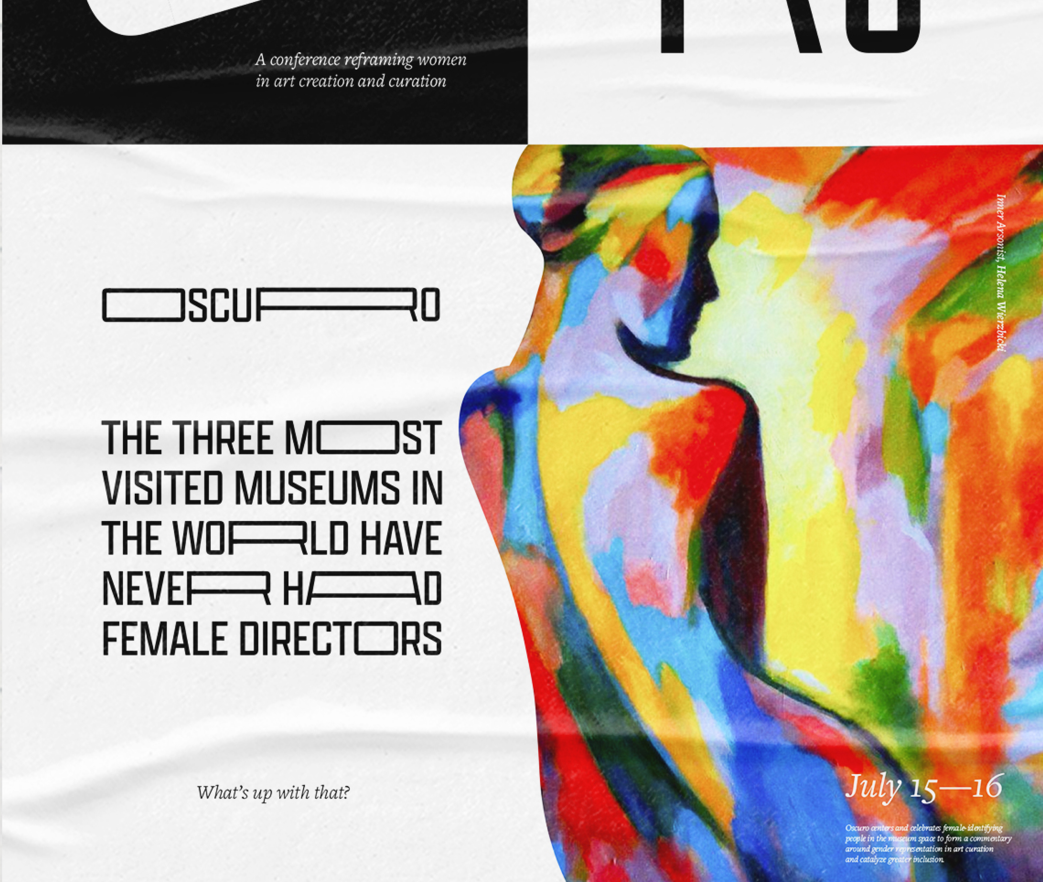
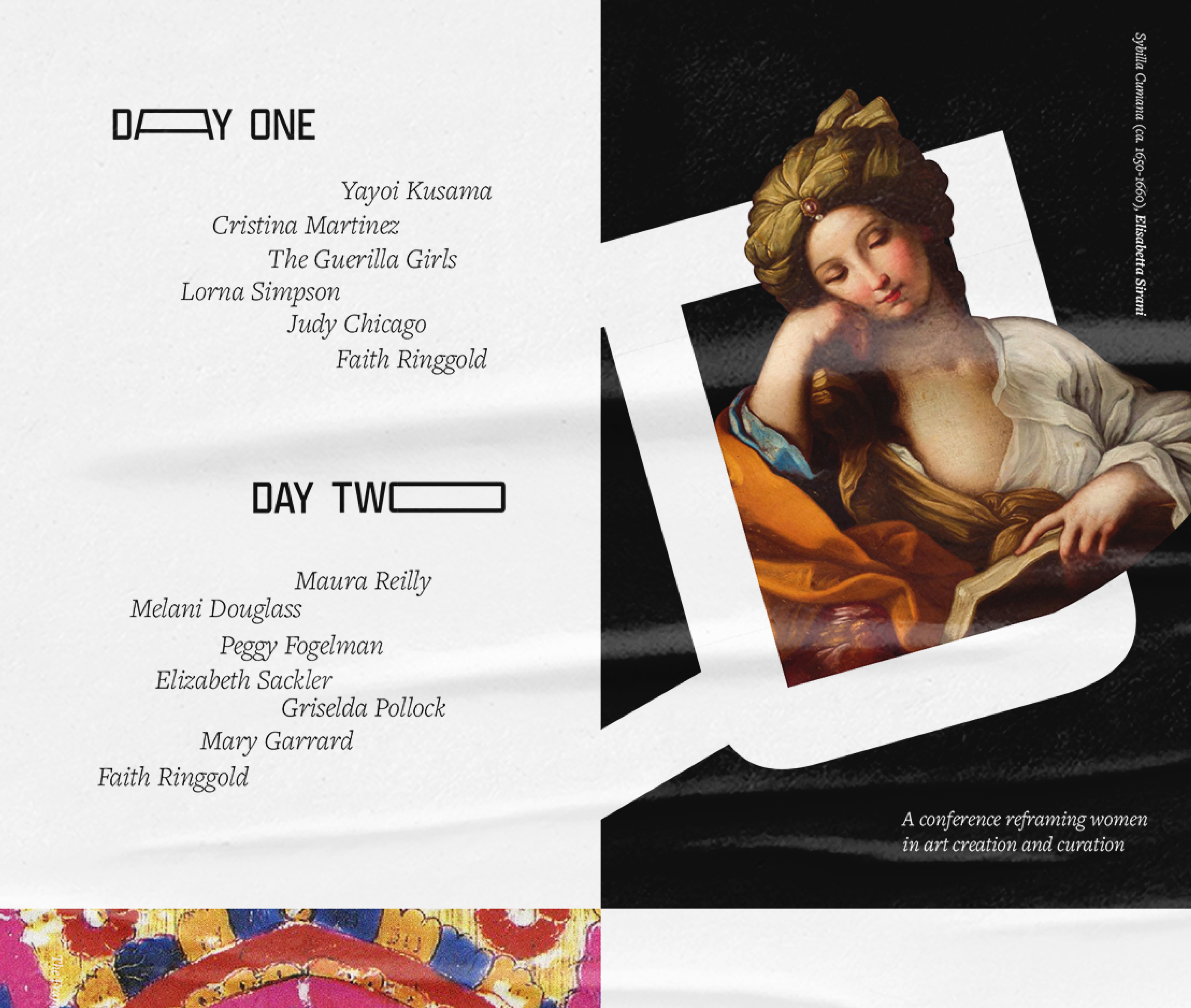
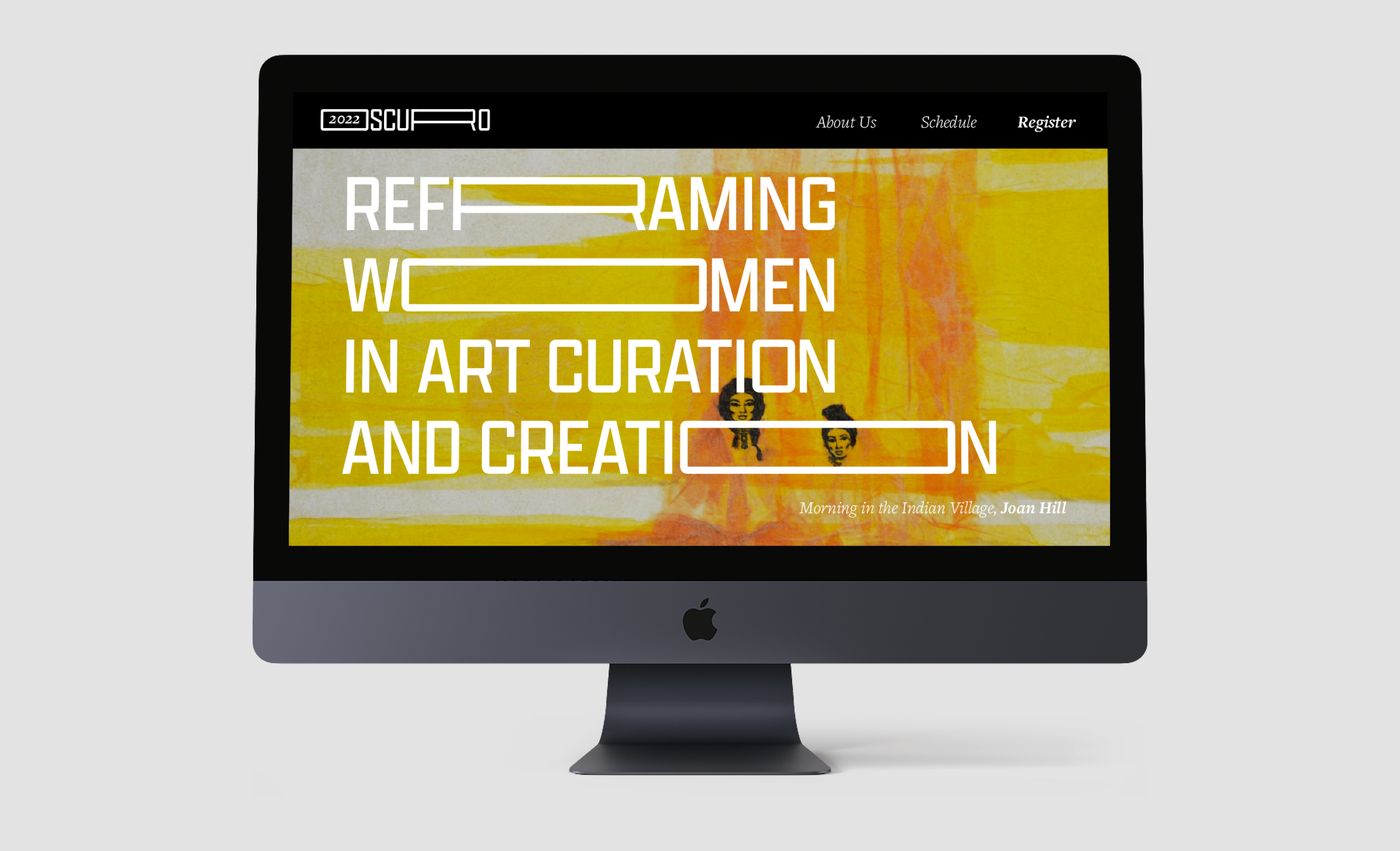
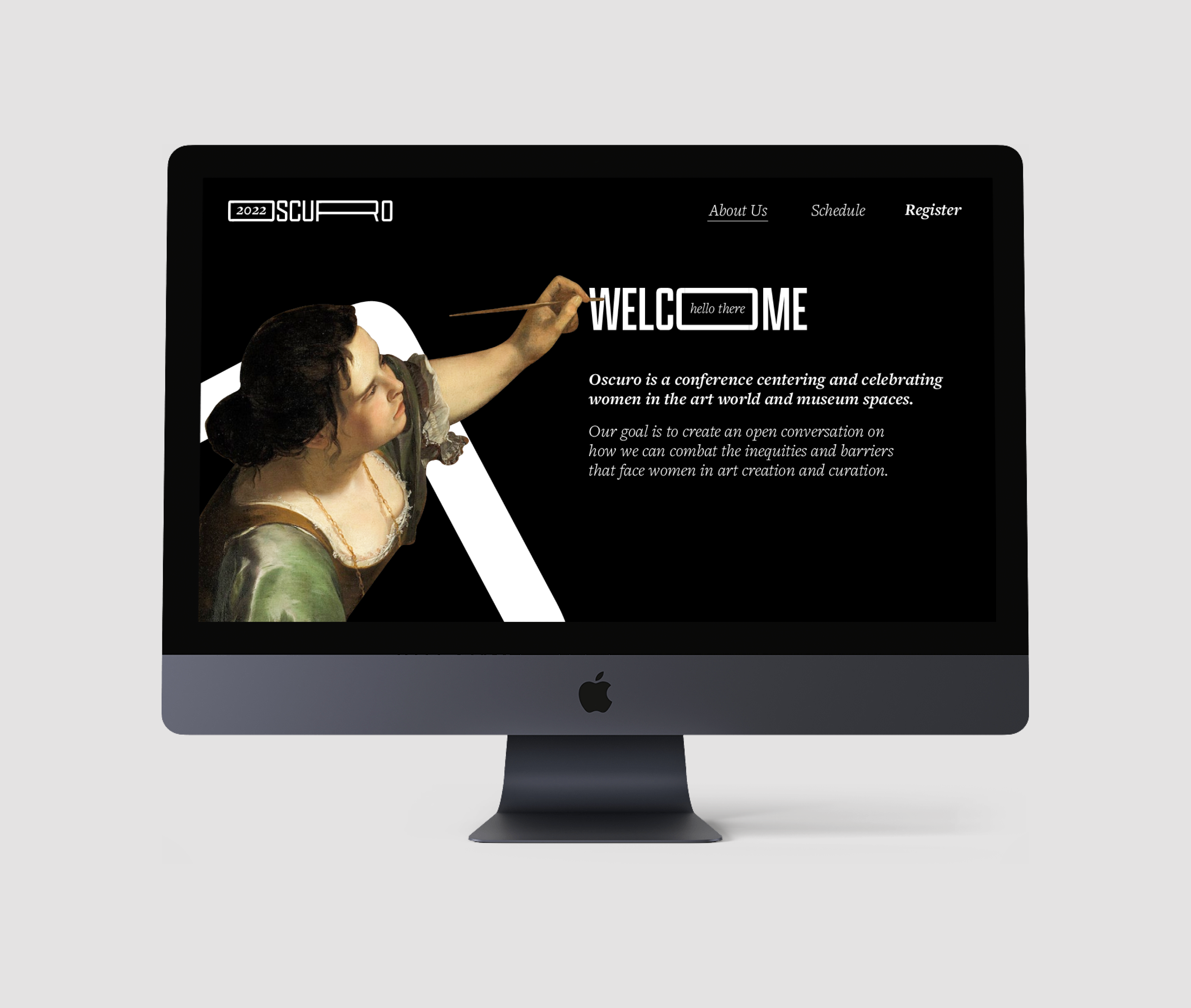
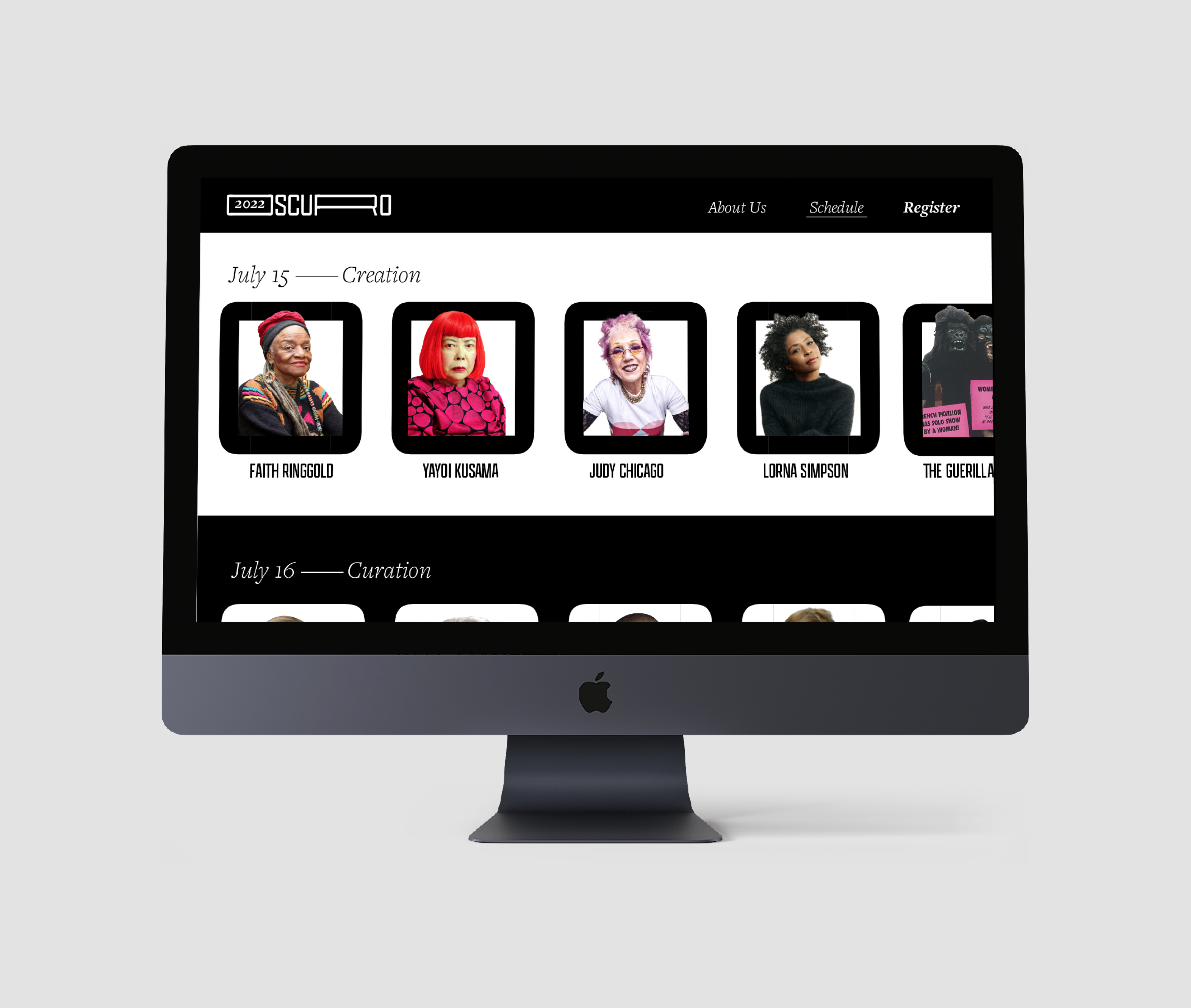
The identity for the conference hinges on a variable, typographic logo which acts as a framing device for the featured artworks. These works, all made by women, provide the sole source of color in the visual brand. Through overlays and bleeds, the art breaks free from the constraints of the conventional frame, or rather, male-centric narratives of art history.
The identity for the conference hinges on a variable, typographic logo which acts as a framing device for the featured artworks. These works, all made by women, provide the sole source of color in the visual brand. Through overlays and bleeds, the art breaks free from the constraints of the conventional frame, or rather, male-centric narratives of art history.

